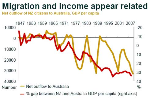
Summer chart series: The inexorable migratory surge to Australia as the income gap widens
5th Jan 10, 9:01am
by
Bernard Hickey picks out 10 charts from 2009 in a series of videos to play over the Summer break. In this video he looks at a chart showing a close connection between the gap between Australian and New Zealand real GDP and the size of the outward migration surges to Australia since the 1970s.
Whenever the Australian economy is performing better than New Zealand's there is a rush across the Tasman.


We welcome your comments below. If you are not already registered, please register to comment
Remember we welcome robust, respectful and insightful debate. We don't welcome abusive or defamatory comments and will de-register those repeatedly making such comments. Our current comment policy is here.